

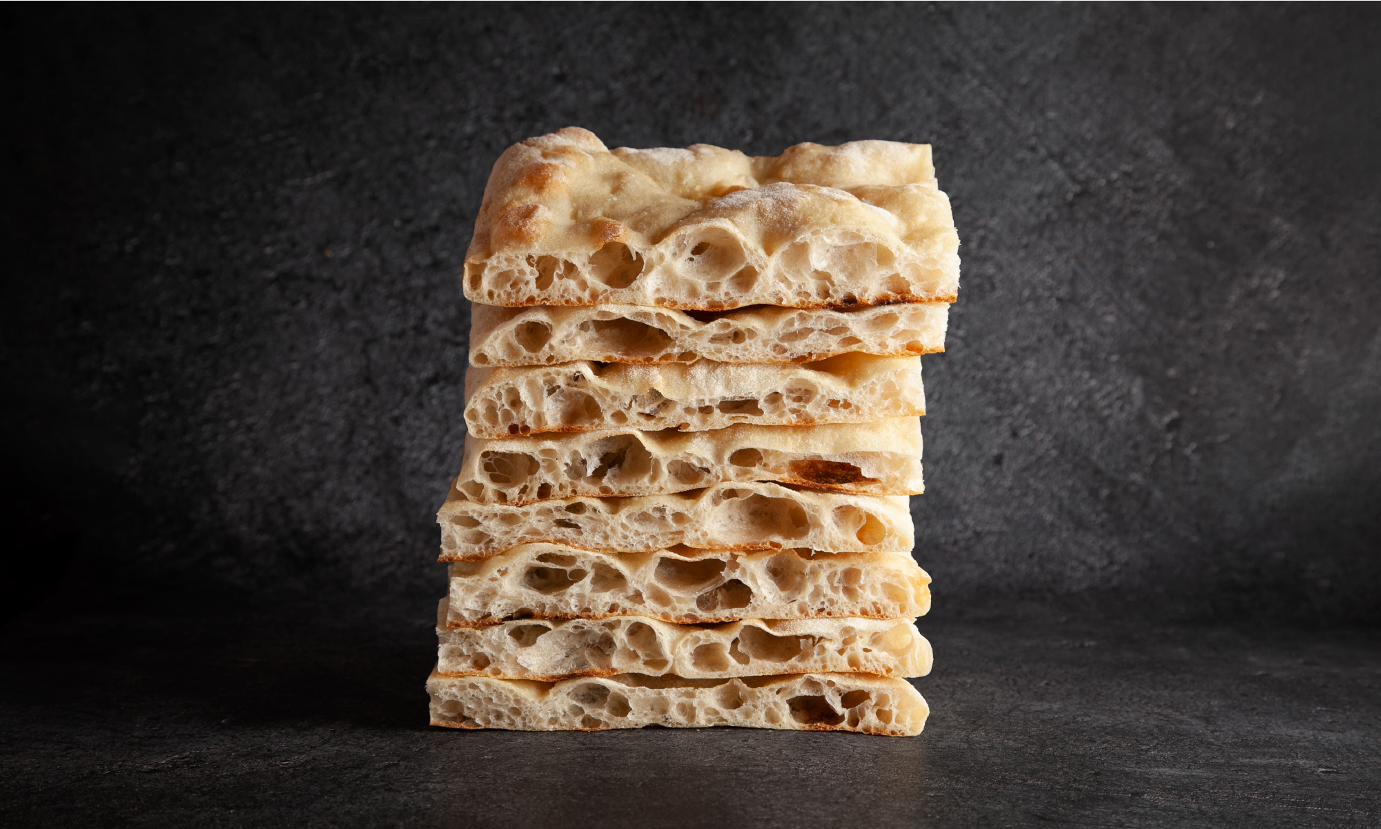

Poco a poco is a peculiar pizzeria: their pizzas are square instead of round, they come in portions, and the dough has more holes than an Emmental cheese. That’s because they serve "pizza in tello a la romana”: the roman specialty that Andrea, the pizza chef, brought from his hometown.
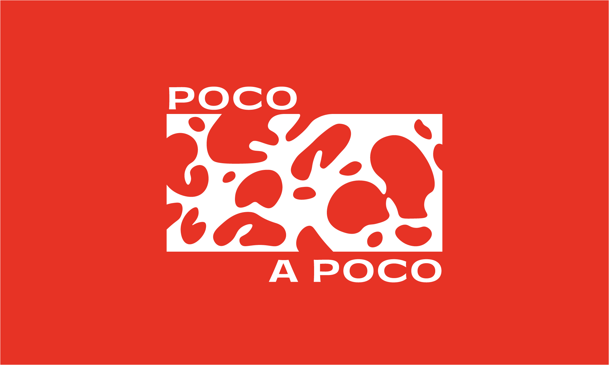
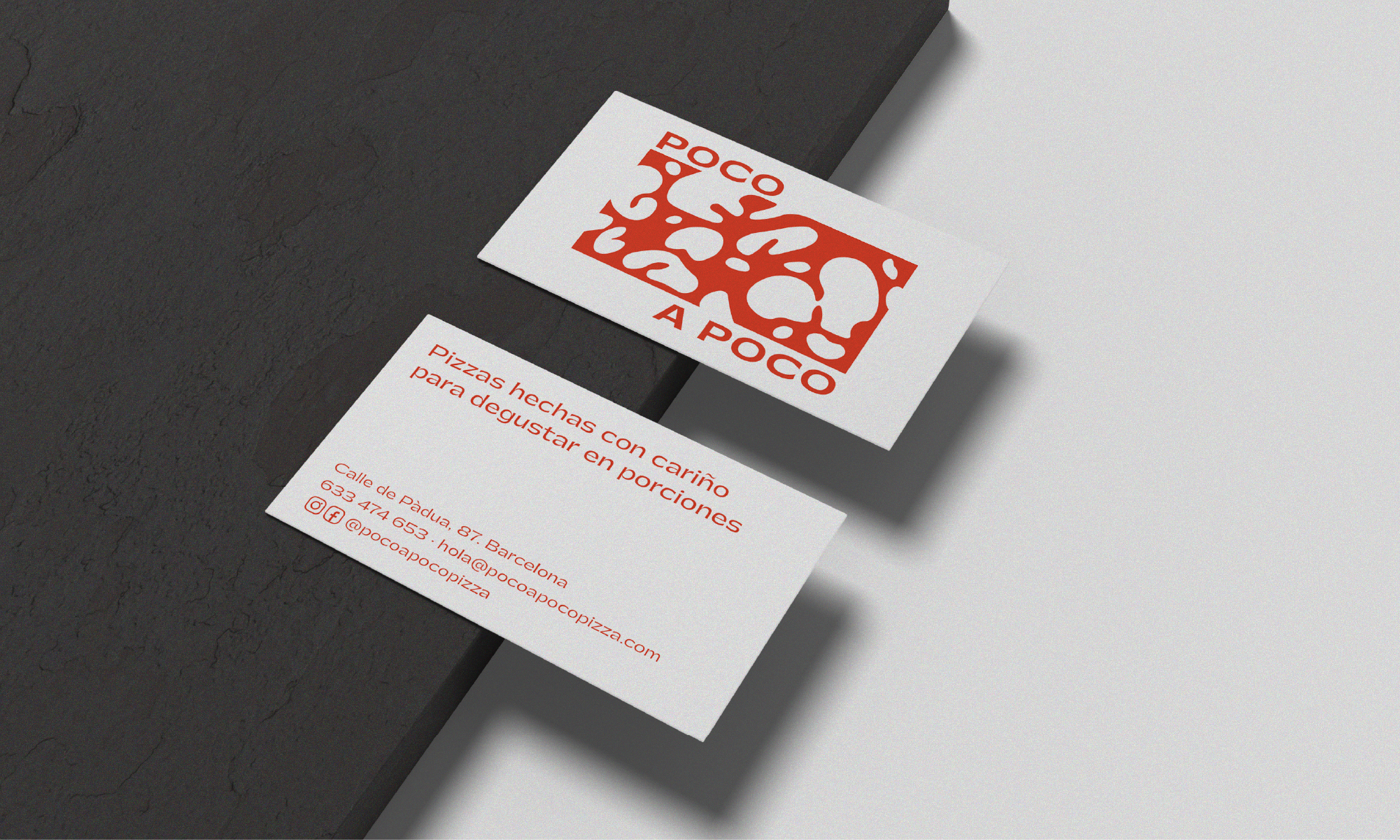
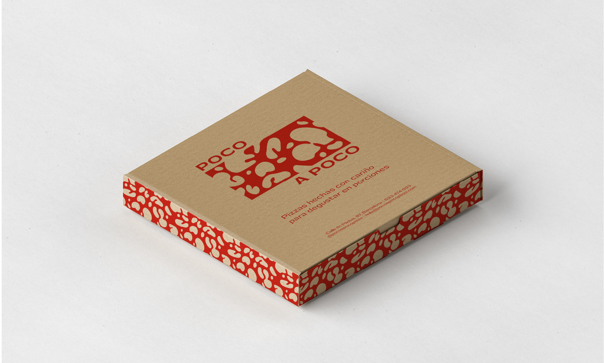
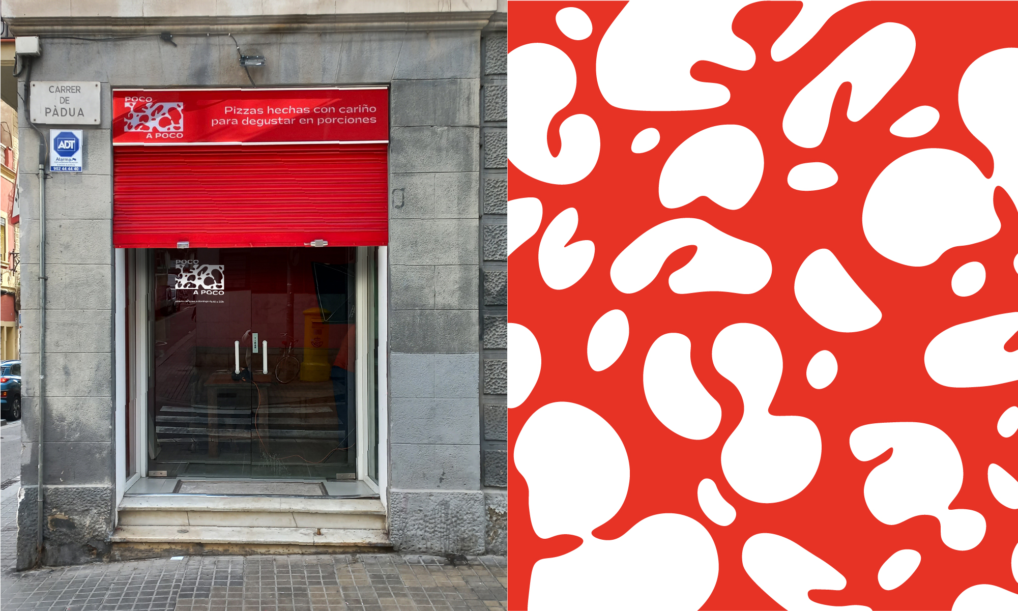
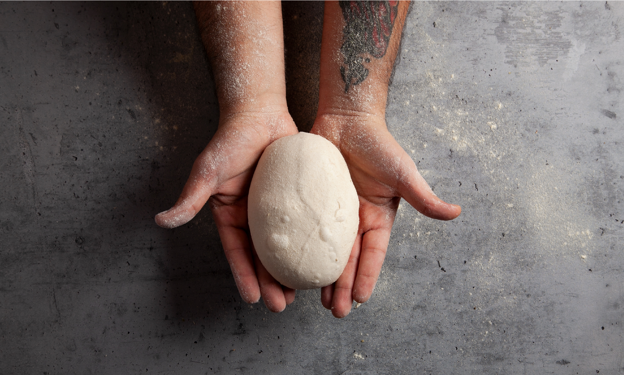
For the identity of the pizzeria we got the inspiration from their unique, high quality product. Parting from its recognizable dough we created a pattern of cavities and holes, which takes the proportions of a slice in the logo and puts a pause between the "poco" and the “a poco".
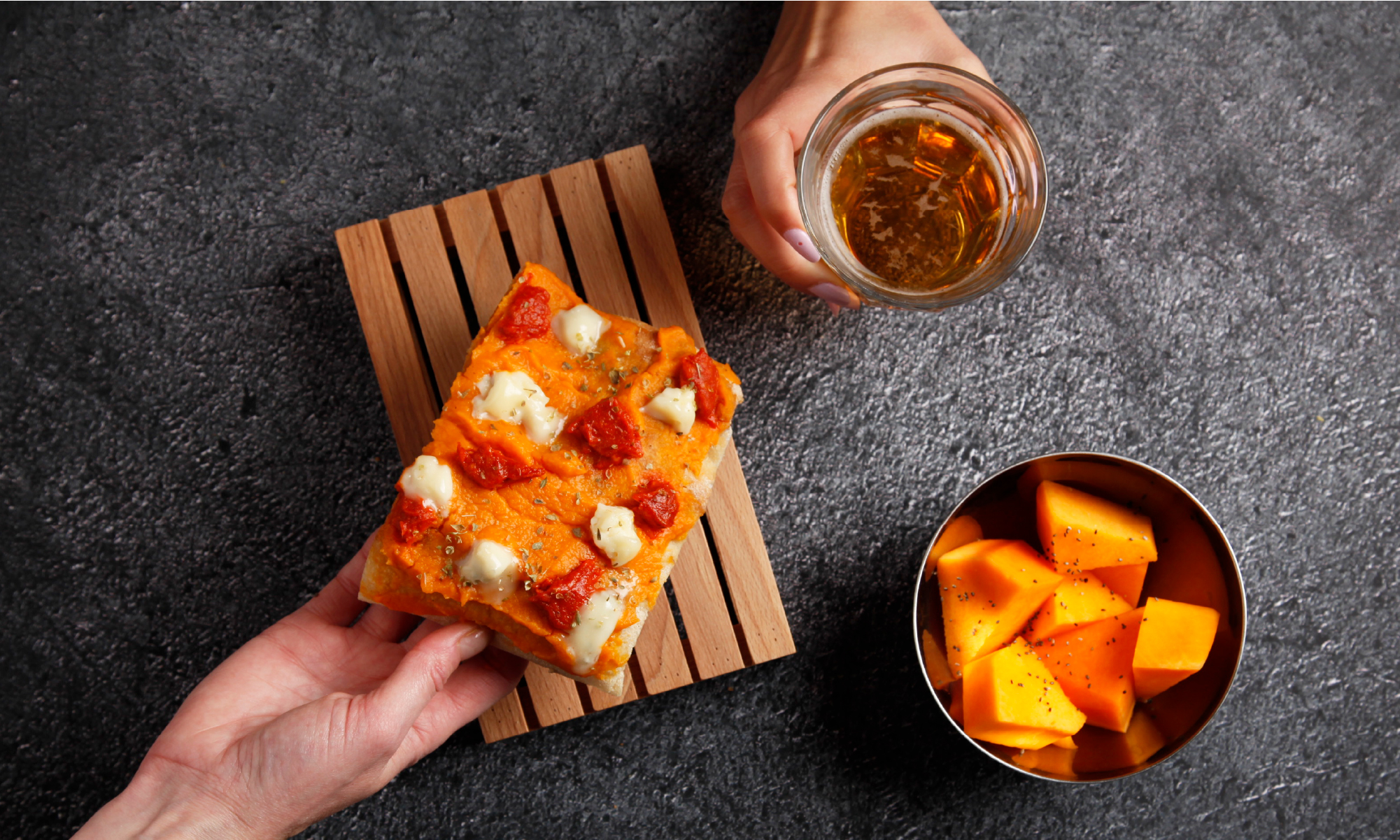
The project was broad, since it covered from the branding to interventions in the restaurant, including the packaging, the merchandise, the website, the art direction and their presence in social networks too. The photographs were captured by Carlota Prats.
The color red unifies the applications, the pattern explains the product and the extended typography transmits the elaboration process, slow but constant, that makes it possible to achieve such delicious results.